According to Smallbiztrends.com smartphones and tablets combined now account for more than 60% of ALL online traffic. So what does that mean for you?
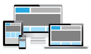
Well, if your website isn’t responsive, it could mean your website looks dramatically different on a tablet/smartphone. Responsive web design allows a site’s layout to change as the screen size being used to view that site changes. A wide screen display can receive a site design with multiple columns of content while a small screen can have that same content presented in a single column with text and links that are appropriately sized to be read and used on that smaller display.
We live in a world where our sites our not only being visited by a variety of different devices and screen sizes, but the same customers are returning to our sites at different times using these different devices. This means that, to best support their experience, our sites must work well regardless of which device they may be using at a given time. The same content that they have access to on one devices must be present when they return on other devices to ensure consistency in the information that they are seeking.